#TheDress or how differences in lighting change colour perception
Choosing the right lighting for a retail shop is fundamental. Whether it's accent, ambient or general lighting, the lamps and luminaires you choose can change the way customers perceive the colour of a room, the shade of an item in a shop window, on shelves and in displays.
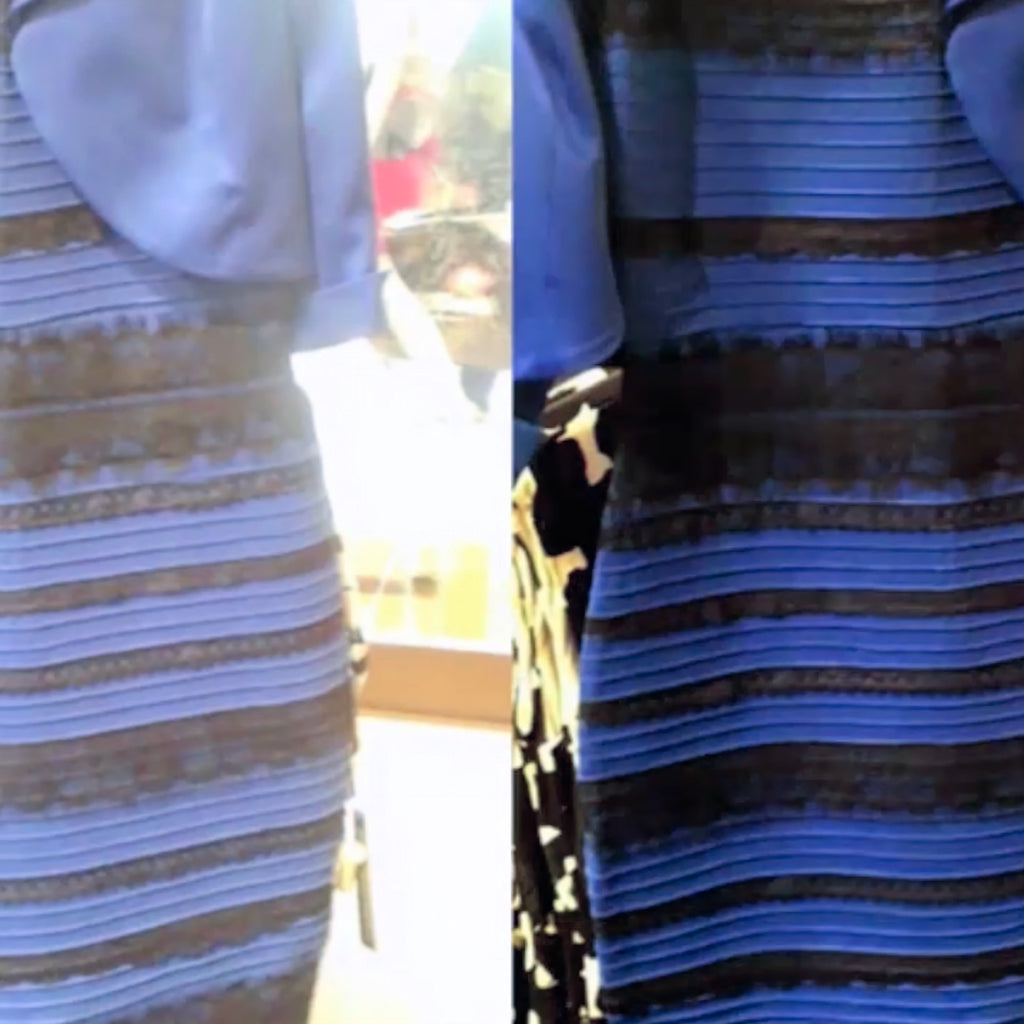
In the worst case, for example, the colours of a striped dress could be perceived as white with gold instead of blue with black...
You don't believe that? Just such a phenomenon triggered an internet hype in 2015 that caused a furore with the hashtag #TheDress.
Blue and black or white and gold? The question of the colour of a dress kept the internet community busy for days.
Different opinions from confused X users (Twitter at the time) spread like wildfire. Even Taylor Swift spoke out at the time. The mystery of the dress confused so many that it quickly crossed the boundaries of the internet and reached major news programmes and talk shows, which saw the dress as white and gold in colour and lamented that the controversy over it was even tearing friendships and families apart.
Eventually, an employee at the shop where the dress was sold confirmed that it was indeed blue and black. So why did some people see white and gold or blue and orange instead of the actual colours of the dress? Shortly after #TheDress was released, Buzzfeed and Wired spoke to neuroscientists to find out exactly what was going on.

In the end, it was just a bad photograph of a dress that Caitlin McNeill's mum wore to a wedding and posted on Tumblr.
However, the public debate around it sparked a whole series of investigations and research with some astonishing results:
Late risers, for example, are more accustomed to artificial light as they spend a greater period of time in the evening under artificial light and were more likely to recognise a blue-black streak.
Older people and women, on the other hand, were more likely to describe the dress as white and gold. These populations tend to get up early in the morning and are therefore more accustomed to daylight.
Natural sunlight during the day contains a high proportion of blue, which is why the brain corrects or filters out the blue components of the light; a kind of "blue blindness" or desensitisation to blue tones develops.
It also turned out that everything had to do with lighting. When the human eye perceives light and colours, it is usually due to the reflection of light from objects. This light reflected by the objects around it enters the eye and hits the retina.
The brain then processes the image in a relative, comparative (not quantitatively absolute) process by recognising and quantifying the differences. It takes the correct colour from the light reflected back from what the eyes see and subtracts this colour from the actual colour of the object.
"Our visual system effectively discards information about the light source itself in order to extract information about the actual reflectance and colour of the object we are looking at," Jay Neitz, a neuroscientist at the University of Washington, told Wired at the time.
This phenomenon is directly comprehensible, for example, with the so-called white point: a white sheet of paper appears "white" after a while, even in candlelight, although it is objectively strongly yellow-red in colour from the fire of the candle flame - a light source with a colour temperature of approx. 1500 Kelvin.
However, our eye can only recognise this if it has a comparative light source with neutral, white light (4000-6000 Kelvin) available.
In other words: Our eye is not "calibrated" to recognise absolute colour values. Instead, it constantly "recalibrates" itself based on the lighting and the surroundings.
Differences in lighting therefore significantly change people's perception of colour. And it can give the impression that colours change depending on the colour of the environment, as in #TheDress phenomenon.
When the Wired photo team used Photoshop to determine the actual colours, they discovered that context means everything. At first, they thought the dress was white and gold in colour. However, when the image was matched to white, there were still signs of blue where there should have been white, and also of black where there should have been gold. When the image was equalised to its darkest pixel and corrected, the dress then appeared real in blue and black.
When the context varies, the perception also changes
Have you ever tried on a blouse, shirt or pair of shorts in a changing room and found that you like the colour, only to discover at home that the colour is completely different? That's exactly the case here.
To avoid creating such a curious headline as #TheDress, you should not only provide bright and "neutral" light in your shop, shop windows and displays, but also light that can display all the colours of the visible colour spectrum!
Remember:
- Only a light source that can produce all the colours of the visible light spectrum without any gaps and reproduce them in the correct proportions to one another can make things appear in the "right light" with the correct colours.
- Every colour needs its "context" - the lighting of the surroundings and the colours in the surroundings are decisive for the "complexion" of the object being viewed.

Fig. 2 Comparison of the light or colour spectrum of some artificial light sources. Black areas are gaps in the colour spectrum that should not be there or do not occur in natural sunlight.
The illustration above shows the differences in the colour spectrum of some artificial light sources compared to a full spectrum light source such as the SORAA Vivid LED. For example, lime green or turquoise colour gradations are virtually non-existent in the spectra of fluorescent and energy-saving lamps.
This means that a turquoise-coloured object "greys", for example. As the colour turquoise is missing in the light source or is not produced, it cannot be reflected by the object - because it is not present - and therefore cannot be perceived by the eye. What remains is a certain "brightness", which we perceive as grey.
At night, all cats are grey... (for the colour turquoise it is virtually "night" because no turquoise light shines)

Fig 3: The complete spectrum of visible sunlight compared to a full spectrum LED and a standard LED. White areas are gaps in the spectrum. E.g. the "cyan gap" or the turquoise gap. Below the visible light of the sun (right) is the infrared range (IR) or thermal radiation. Above the visible range (left) is the ultraviolet range.
Both wavelength ranges above and below visible light are undesirable for lighting solutions. IR radiation - i.e. heat - means a waste of energy in a light source. UV radiation is also undesirable as it is harmful and has a bleaching effect. Colours fade in the long term and materials can become brittle.
The development of light sources that fulfil all requirements is anything but trivial.
It is no coincidence that one of the founders of SORAA, Prof Shuji Nakamura, was awarded the Nobel Prize in Physics in 2014 for his developments.
Book a free consultation appointment now!
