We are here for you and will be happy to provide you with comprehensive advice on our products. Simply arrange a personal consultation appointment!

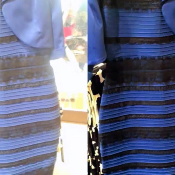
#TheDress or how differences in lighting affect people's perception of colour
Choosing the right lighting for a retail shop is fundamental. Whether it's accent, ambient or general lighting, the lamps and luminaires you choose can change the way customers perceive the colour of a room, the shade of an item in a shop window, on shelves and in displays.
In the worst case scenario, for example, the colours of a striped dress could be perceived as white with gold instead of blue with black...
You don't believe it? Just such a phenomenon triggered an internet hype in 2015, which caused a furore with the hashtag #TheDress.
 The art of differentiated reproduction of white tones without ultraviolet radiation...
Fig.1 Natural sunlight can be approximated very well with SORAA's full spectrum approach, resulting in a high colour fidelity index Rf. Here, the individual peaks of the violet booster and the three phosphors (blue, green, red) are superimposed to generate the full spectrum.
So far, however, one crucial question remains unanswered:
How do we achieve a clear and differentiated reproduction of white tones?
Why do white tones differ from colours at all?
This is because many white materials contain so-called fluorescent, whitening substances, optical brighteners.
These substances absorb the invisible, ultraviolet light and emit bluish, visible light instead. Our eyes, in conjunction with the brain, register this as an increase in whiteness.
Optical brighteners are omnipresent: they are found in many manufactured white materials (fabrics, paper, plastics...) and are also naturally present in our teeth. They are responsible for this absorption of ultraviolet radiation and conversion to blue.
Even though we all like the bright, clear white, in most applications we do not want the harmful UV radiation that makes it possible to perceive these white tones.
Conventional LED products naturally avoid UV radiation - but this means that they do not stimulate the brighteners and always make white objects look yellowish and dingy.
SORAA has found an elegant solution to this problem:
It turns out that optical brighteners can also be excited by harmless violet light - not ultraviolet light - at a carefully chosen wavelength. The trick that SORAA uses to reproduce natural white is to replace the UV light typical of sunlight with the right amount of simple violet light:
The whiteners or optical brighteners are then excited exactly as they would be under natural light with UV detail.
Fig. 2 illustrates this relationship:

Fig. 2 Halogen and incandescent light excite white colours due to their "UV tail". In an intelligent LED design, this can be imitated with a peak of violet light, which also excites the optical brighteners. In this way, the harmful effects of UV radiation are completely avoided.
How can this effect be expressed in figures? It is somewhat surprising that there is no stringent answer to this question. This is partly because the majority of the lighting industry, which uses LEDs with a "blue" source and has no way of determining the degree of whiteness, is completely unaware of this issue.
And furthermore, to be clear, the colour rendering metrics (including CRI and TM-30) say nothing about white rendering!
This means that a source can have a very high Rf or CRI but terrible white rendering.
Fortunately, the underlying colour science is quite well understood and it is possible to derive a metric that measures the rendering of white objects in analogy to the colour rendering index Rf.
Based on internal research and academic collaborations, SORAA has done just that and developed the white rendering metric Rw. As you would expect, the Rw value for natural light is around 100.
And this shows the compromise I promised you. To achieve the best colour fidelity, we should get as close as possible to the shape of the natural spectrum - but, to achieve the best white fidelity without UV, we need to add some violet light - not ultraviolet light - to the spectrum, which then deviates from its natural shape!
In short, we are faced with an antagonism between the homogeneous reproduction of colours and the entire spectrum versus the white tones. Precise measured values are crucial here, because this compromise should be as good as possible.
With the help of Rf and Rw, the spectrum of the SORAA Vivid light sources was designed to get the best of both worlds.
This was achieved by optimising the wavelength and intensity of the violet boost in relation to the spectra of the three phosphors. To achieve better performance, special attention was also paid to another TM-30 index, Rfh1. This parameter, which measures the red rendering, is the modern and better equivalent of the CRI R9. In fact, the rendering of red tones is very important for our perception - Rfh1 is therefore at least as important as Rf, perhaps even more so.
As a result, SORAA Vivid delivers very high values in all metrics: Rf = 91, Rfh1 = 95 and Rw = 100. It is a stroke of luck that this particular compromise could be found and optimised without losing the essential aspects of a full spectrum light source.

Fig. 3 TM-30 colour patches with colour distortion metrics. On the left, a SORAA Vivid with high colour fidelity and high white fidelity (Rw). Right: Seemingly almost identical, a standard LED with a high CRI has a high Rf value but does not reproduce any white at all, Rw = 0 - not recognisable with the TM-30.
For comparison, let us now look at an LED source (Fig. 3, right) that has been "naively" optimised for colours only: The colour fidelity could reach Rf = 95, but the white fidelity would drop to Rw = 0. If this example sounds too dramatic, let me remind you that this is exactly what every (blue) high CRI booster LED, which makes up the vast majority of products on the market, does!
As anyone who has looked at a white shirt under a SORAA Vivid LED and under a competitor LED comparatively can attest... the difference is striking!
I hope that these insights will give you some decision criteria:
1. designing a light source is a multi-layered and challenging task, mixing technical and physical aspects as well as subjective perception.
2. accurate measured values are important because they are the design tool with which we can ultimately make and subsequently validate decisions.
Conclusion: Don't just pay attention to a single measurement, but to a variety of indicators that are relevant to your application, such as overall colour fidelity, reproduction of red tones and gradations of white.
The complete range: SORAA Full Spectrum LED
Book a free consultation appointment now!

Colour enhancement based on TM30
When should we use such colour-enhancing light sources? This is an interesting question to which there is no simple answer.
First of all, we need to realise that just because something is preferred in a comparative experiment does not always make it better. Let me give an analogy here: If you serve two otherwise identical dishes, one of which contains more salt than the other, most people will favour the saltier dish. However, we certainly don't conclude from this that more salt in our food is always better!

TM-30 and colour enhancing products | SORAA Color Enhance
There are a variety of colour enhancing LED sources on the market, but as far as I can fairly judge the competitors' products, I have to say that I'm not impressed with what I've seen so far. In short, these products often have an unpleasant way of saturating colours while producing a pinkish hue of light. We are familiar with these lights from meat and sausage counters in various supermarket chains, for example.
No more pink-red islands of light, but consistent colouring with the same white point and yet the desired colour enhancement of the red tones for the counter display would be desirable. This is exactly what you can achieve with the SORAA Enhance Filter in combination with the SORAA Vivid LED.